


With the constant evolution of devices and capabilities, more and more users are adopting mobile devices for browsing purposes. In fact, according to a recent comScore survey, we’ve passed over the “mobile tipping point”. This means that majority of visits are made using mobile devices than desktops.

Essentially, as an increasing number of people are moving to new mobile tools, it has become needful to re-think and adapt our website content keeping mobile users in mind. Moreover, for site owners running mobile optimized websites, making their website truly mobile-friendly has become a hard-to-ignore necessity post the release of Google mobile-friendly update.
So, if you own a WordPress website designed for desktops and planning to go mobile, or want to make your current site more optimized for mobile, then following the steps covered in this post will definitely help you accomplish your objective.
Step 1 – Use a Mobile Plugin
Don’t have enough time to convert your existing WordPress theme to a responsive one? Well, in that case, installing a mobile-specific plugin can help you get all the work done effectively and efficiently. Using a plugin can help in making your website mobile-friendly without much hassle. Below are a few plugins that you can consider to meet the varied requirements of a mobile website:
WP Touch: Touted as the most popular mobile-specific plugin, WP Touch helps in loading a beautiful mobile version for your mobile visitors automatically. The best aspect about this plugin is that, it enables a mobile theme that has passed the “Google Mobile” test.
WordPress Mobile Pack: It’s no more a hidden secret that users spend most of their time in accessing digital content via mobile apps compared to a mobile website. Wouldn’t it better if you could reuse the content of your site (ideally a blog) for a cross-platform app?You can make this task possible with the help of WordPress Mobile Pack plugin.
Apart from the above two plugins, there are many other great mobile-specific plugins available in the WordPress Plugins Repository and other online sources – that can be used for building a mobile site.
Step 2 – Create a Separate Website For Mobile
You may be using some features on your regular website that might not be necessary for your mobile visitors. Perhaps, you may wonder to get rid of those features. But, what if the features that you want to be eliminated are important for desktop users? In such a scenario, creating a separate mobile site will prove a viable solution for you.
Building another website may seem a daunting task to you, at first. But, in reality its not that difficult, as you don’t need to build the entire website again from scratch. Instead, you just need to create a few significant pages and add certain features to your mobile website. However, you’ll need to write some code in the process. So, make sure to hone your programming skills before getting started with the process.
Step 3 – Using Media Queries to Make Your Site Responsive
Even if, you’re considering going mobile, you may not want to dump your existing WordPress theme. If that’s the case, then you can consider making your current theme responsive. And one best way to do so requires making use of a media query.
Media queries help in changing a website properties based on the properties of a device. It comprises of 3 main parts:
- the @media rule;
- type of media;
- and max-width of the screen of your target device.
Let us look at the below code of line that contains a media query used for targeting small-screen mobile phones (i.e. devices in portrait orientation) having a maximum width of 320 pixels:
/* Mobile Phones in Portrait */
@media screen and (max-width: 320px) and (orientation: portrait) {
}
Below is the list of a few other commonly used media queries for different screen sizes:
- (max-width: 480px) and (max-width: 780px): Used for Smartphones that are 480 and 780 pixels wide respectively.
- (max-width: 1024px): Works for tablets in both landscape, as well as, portrait orientations.
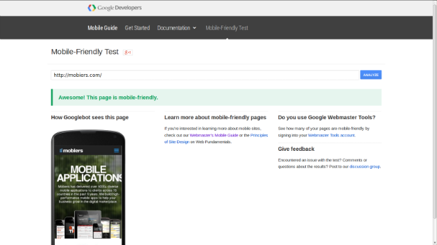
Step 4 – Use Google Mobile-Friendly Tool to Test Your Site Responsiveness
Even if, your website can be accessed across different mobile device doesn’t mean it is mobile-friendly. Put it simply, you may be running a responsive website, but it might provide a positive experience to mobile users. This may even make you lose your search engine rankings based on Google’s new mobile-friendly algorithm update.
Thankfully, you can find out whether your site is mobile-friendly or not using the Google Mobile-Friendly Testing Tool. Here’s a screenshot of my website that passed the test:
Step 5 – Use Google Webmaster Tools To Make Your Mobile Site SEO-Friendly
So, now once you know about mobile responsiveness of your site, you also need to ensure that your site is optimized for search engines. If your mobile theme isn’t SEO optimized, then you won’t be able to drive good traffic to it. Fortunately, Google offers excellent Webmaster Tools (a toolset) to help maximize your website search engine ranking.
The toolset provides information about keyword rankings, traffic trends on the basis of content and other useful data, helping you create an effective SEO campaign. For using the toolset provided by Google, you’ll first have to login to Google Webmaster Tools, and then add it to your site. Next, you will have to verify yourself as the owner of the website. Once your site has been verified, you’ll be able to see data on your website, as shown in the screen shot below:

In the next few steps, we’ll discuss about customizing your WordPress installation, so as to make it more mobile-friendly.
Step 6 – Create Mobile-Specific Menus
No matter whether you’re running a responsive WordPress theme, being unable to display the menus accurately on a mobile device can impact the overall experience a user has when interacting with your site using a mobile phone. Remember that the menu used in your desktop website won’t work on a mobile site.
One more important thing to consider is that, the content priorities of your mobile users won’t be same as that of your desktop users. For example, a desktop user will like to view a link to archives, while a mobile visitor may not. Basically, desktop viewers usually favor accessing detailed information about your brand. On the other hand, mobile customers only want relevant data such as the most important product details and contact information.
One best way to create a mobile-specific menu is to use the WPtouch plugin. That’s because, it provides an option to determine whether a menu need to be used on mobile devices.
Step 7 – Make Your Content Adaptive to Mobile Theme
Other than your website menus, you also need to make your content adjust properly to a mobile device including:
- Long titles or headlines
- Images containing text or numbers
- Products with “View More” and “Buy Now” options and so on.
It is very important that your content looks good without impacting its quality on the desktop. This can be achieved, by making your content adaptive. This is because, adaptive content help make the content appropriate according to a specific mobile platform by replacing the content with shortcodes and creating other alternatives.
Step 8 – Make Your Images Optimized For Mobile
One of the common issues that many site owners running a responsive WordPress site has experienced is that the images are not optimized for mobile devices. But, you can make the images responsive, by assigning them a maximum width of 100%. This helps in automatically re-sizing the images that are large in size for a mobile device. For this purpose, simply add this code to your CSS file:
img {
max-width: 100%
}
In case, you want to resize your background, so as to make it fit for a mobile device, then you just need to assign the background-size CSS property a value of “contain”, as follows:
.header {
background: url(header.png) 50% no-repeat;
background-size: contain
}
The above code will change the size of the background image if the screen is too small. But, making the image smaller in size can have a profound impact on its quality, except when it is being viewed on any modern mobile device. However, to avoid such a scenario make sure not to assign the meta tag used in your website to “user-scalable=no property”. Doing so, will restrict your users from performing actions such as: zoom in and out.
<!– Avoid this line of code! –>
<meta name=viewport content=’user-scalable=no’>
Step 9 – Turning Your Site Layout To Single-Column Layouts
When you’re creating a layout of your website, going for a single-column structure will work the best for you. Such a layout not just help manage the limited space of small-size screens, but also help to easily switch the website layout to and from portrait and landscape mode.
You can make your multi-column desktop layout, adjust to a single-column layout with the help of responsive web design techniques, such as the Basecamp project and others.
Step 10 – Take Advantage of Mobile Capabilities
Lastly, to make sure that your site is mobile-friendly, you need to ensure that it provides an optimal user experience. One best way to let mobile users enjoy an enhanced experience via your website is to add mobile capabilities within your website.
For example, you can embed the geolocation capability to help users get directions, view in-store availability of desired products at the nearest retail store, and much more.
Conclusion
Following the 10 steps as discussed above will definitely help you make your WordPress site mobile-friendly. But, in case you’re still having some difficulty in the process, you should consider taking some professional assistance. I’ve tried covering some of the best ways that not only will help you understand how you can create a mobile-friendly WP site, but will also serve as important tips on making an already responsive site more than before.

3 Responses
Hi Arpine,
Thanks for the comment. Yes you can adapt the content for every single mobile device size. However, I will suggest you to go for responsive design instead of adaptive. Since it is not easy to make you content adjust to every single device size.
Hi Lucie,
Thanks a lot for the tip 🙂
Hey Lucie,
Great tips.
I particularly like the idea of adaptive content. Do you need to adopt the content for every single mobile device size?