One thing I noticed when running a small web design business was that a number of beginner designers that we (me and my friend) were trying to hire didn’t have a grasp on the design-business connection, so to speak.
What I mean is that design was always a tool (a method) to achieve a specific business goal … at least from a website owner’s perspective.
Designers who considered themselves artists had big problems abandoning some beautiful design tweaks even once they realized that these tweaks were bringing nothing in terms of the ultimate business goal, or even made it harder to achieve.
And one of the classic examples of how art doesn’t go well with business is the matter of conversions.
Now, I’ve chosen to create this article around WordPress, but you can actually take this advice and apply it to any other platform as well.
Let’s start with the first big question:
What is a conversion?
I know that I’m lazy, so forgive me for using Wikipedia to explain the idea of a conversion:
In internet marketing, conversion rate is the ratio of visitors who convert casual content views or website visits into desired actions based on subtle or direct requests from marketers, advertisers, and content creators.
A conversion is therefore a single occurrence of such an action.
Going back to plain English… For example, if the business goal of a given page is to get people to fill out a form then a conversion happens every time someone manages to do it successfully.
There are no boundaries regarding which action can and cannot be regarded as a conversion. Every business goal is suitable for this.
The benefits of improving conversions
Another big question is why should you care about improving conversions?
From a business perspective, conversions are what makes a business profitable. And if a website is to be a worthy investment then conversions are what makes that website valuable enough to keep it alive.
Picture this, have you ever heard of a business that decided to close their website even though it was profitable? Probably not.
To put it simply, once you manage to improve the conversion rates your website generates, you will raise your profits without spending any additional money on marketing.
The elements of a conversion for a WordPress site
WordPress is a great platform to work with for lots of reasons. Putting all the available frameworks and plugins aside, there are also great customization possibilities built in right from the get-go.
Luckily, improving conversions usually requires only some tweaks to the current theme and maybe one or two new custom page templates.
Let’s therefore start the list with:
Headlines – they get the attention
Headlines are always extremely important for any kind of publication. No matter if it’s a newspaper or an online publication (like a WordPress site) it’s always important to focus sufficient attention on the headline itself.
The easiest trick in the book is to make it HUGE.
I’m not joking. Here’s an example (Copyblogger):
Notice how big the headline is in relation to my whole browser window.
I know that huge headlines may not look great in your current design, but if that’s the case then it’s your job to make them fit.
Apart from the size, what also matters is the font, its color and style. Basically, a headline’s job was never to blend in… If yours does, you’re doing it wrong.
Focus on simplicity
I know that there’s always that one more bell and whistle you can put on your site … a box here, a widget there, and so on, but knowing when to stop is a really handy skill.
The best sites, from a business perspective, are the simple ones. Simple designs make the main message more visible and a lot more clear. For instance, if there’s only one possible action point on a webpage then there’s not much that can distract the visitor.
WordPress allows us to follow the above guidelines by doing a handful of things:
- Use more one-column layouts. Of course, you don’t have to make the whole site a one-column design, but the conversion-heavy pages will surely benefit from this (like a sales page, for example). Most modern theme frameworks have ready-made templates for full-width pages (ThemeFuse, Genesis).
- Minimize headers and footers. Big footers are quite fashionable these days, but they do very little in terms of improving conversions. I would advise to use the most minimalistic footers possible in your conversion pages. Same story with headers, you just don’t want to distract people from the main action (more on that in a minute).
- Close the comments. Comments are just another distraction. Most of the time they don’t bring anything of value to your conversion pages.
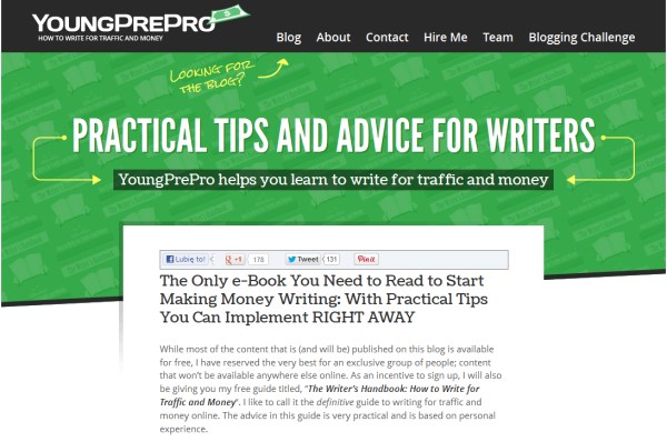
Here’s an example (YoungPrePro):
As you can see, the homepage design features only a simple header, then a massive headline, followed by a block of text. No sidebars, no unnecessary clutter.
Careful eye direction
Developing a proper eye direction path is probably one of the most elusive skills among website owners. The thing is that some elements on a page are the core of its purpose (like a sales form, for example). Some are just complementary and meant only to make the main one more attractive or compelling (like a guarantee or a testimonial).
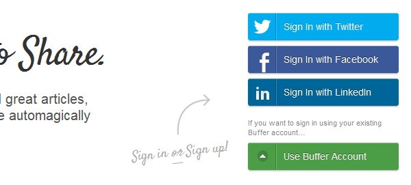
The easiest trick you can use to guide your visitor’s attention towards the main element are some simple arrows, borders, and maybe even a different color scheme. This is again about standing out instead of blending in.
Here’s an example (Buffer):
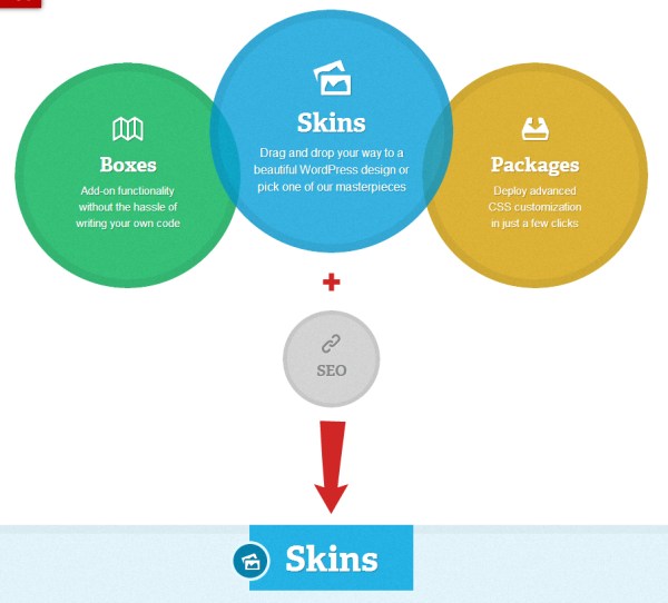
And another one (DIYthemes):
Use the right colors
This is a kind of a mind trick, but some say it works quite well. We all know that colors arouse specific emotions. Some of those emotions are not that great for converting (buying), but some are marvelous.
For instance, blue is the color of safety. Many badges created to present a guarantee are often made blue.
Red, on the other hand, instructs us to stop. For instance, a red button labeled with “buy now” won’t make you much money. Orange is a lot better color. It’s almost as noticeable as red, but it doesn’t convey all the negative emotions.
We could go on and on about colors here, so I’ll better stop now. I encourage you to check some color charts on the internet that explain the meaning of each color in most cultures (always consider the target group of the website you’re working on).
Showcase trust elements and social proof
One of the biggest problems for sites fighting for conversions is to create instant trust, so people would believe that what they’re being presented with is a quality product.
There are two ways of building such instant trust:
(1) Use trust elements – logos and badges of respected brands. Those brands must have something to do with the site/product. For instance, displaying a visible block saying “as featured on The New York Times” is sure to create some instant trust.
Here’s an example (Raven Tools):
(2) Use testimonials. A good approach is to reach out to your existing customers or partners and ask them specific questions about your business. Then you can publish the answers as testimonials.
Use big “purple cow” buttons
The concept of the purple cow was something first explained by Seth Godin. The main idea is that the only way to stand out is by presenting an element that’s simply too outrageous to be overlooked – something like a purple cow standing in the middle of the living room.
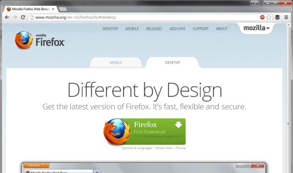
Basically, purple cow buttons are big and colorful. And I really mean big. Like this big (Firefox):
Notice the size of the download button in relation to my whole browser window. And even though mozilla.org isn’t a WordPress site, you can still use this concept pretty easily. All you have to do is to make your call to action buttons to be at least 1/3 of the whole width of the page. I know it’s much, but hey, you really want people to click your buttons and convert, don’t you?
Speaking of calls to action…
Use simple calls to action
A call to action is the ultimate conversion maker. Period.
Making the button visible is one thing. But making the message displayed on the button direct and understandable is another.
The main guideline is this: If you want people to do something (handle some specific action) then you need to tell them exactly what you want them to do.
For example:
- Click here to buy the _____.
- Add to cart.
- Submit your email here.
- Click here to download the ______.
- Fill out this form and click Submit.
Here’s a nice example, the call to action is clear and straightforward:
As a matter of fact, the call to action should be no less visible than the headline. Make it stand out so it’s easily noticeable to everyone. Even if they’re just scanning the page and not reading the full contents.
When it comes down to the raw work, this is quite easy. A big button with a well crafted call to action text is enough. But you need to make sure that such a button works well with your design, and that’s the only difficulty (and by working well I actually mean standing out).
I’m confident that if you take the above guidelines into account, you will be able to improve the conversion rates your websites generates. Most of the time, you don’t even need any extra plugins for this, or any specific theme framework, which in my opinion is great.
What’s your take on this whole business-design connection? Do you share my opinion that beautiful doesn’t always convert?
If you enjoyed this post, make sure to subscribe to WP Mayor’s RSS feed.


